
All sorts of loose-ends need tidying up now that I’m past a software delivery crunch. Here’s one.
I was asked recently to do a box-whisker plot of some raw data out of this species optimisation framework I’ve been working on.The boss mentioned Excel in passing, so I got fixated on trying to do it with Excel, instead of the more sane approach of using a tool better suited to the task.
Turns out it’s bloody hard to do in Excel (peeps, consider R for out-of-the-can box-whisker plots). You need to go through the rigmarole of using a stacked bar graph to plot deltas for the Minimum, Maximum, 1st, 2nd and 3rd quartiles, all of which you’ll need to derive yourself. Here’s some detailed instructions that didn’t suck/weren’t wrong.
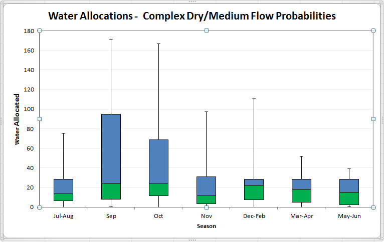
Excel Box-Whisker Plot
Finally, because I never want to waste that much time again getting Excel to do box-whisker plots, here’s an example Excel file that does one for you.


Reblogged this on Sutoprise Avenue, A SutoCom Source.
LikeLike